

Saturday, April 21, 2012
Vikky Miller - Polishing Concept.
The past few months have been extremely busy. I love the work, but it leaves me little time for my personal projects Most of my clients projects have NDA's attached to them, so I can't update with any progress on here. Last week while unwinding, I took a little bit of time to work on the look for Vikky. Attached bellow is what I came up with. I feel that the conceptual stages for her development are done, now onto production.

Friday, February 17, 2012
First Time Lapse
The past few weeks have been extremely busy for me so I haven't had the time to update this as much as I would like. I did however have the time to do a quick drawing in the morning one day this week. (Although I didn't have time to finish it.) Bellow is the said drawing.
This is the first time lapse drawing I've done. It's actually kind of educational for for me to be able to watch the process and see what I'm doing right and wrong. I think I spent about a couple hours on this one, not sure, wasn't keeping track.
From the video, you can see my process is to do a rough sketch, block it out, sketch, block, sketch, block, and so on, until I have something I like. This way probably takes longer than it should, but as of right now, as I'm still developing my drawing skills, it's the only way I know. Maybe with my next drawing I'll try a different way. Hopefully over the weekend, I'll have the time to come back and finish this.
We'll see...
Friday, February 10, 2012
Concept Work - Hit or Miss.
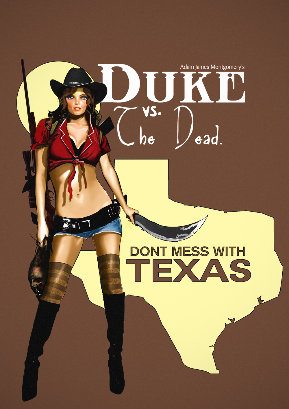
Last night I did a quick concept comp for Duke vs. the Dead. I was trying to figure out what kinda vehicle would be in it. Bellow is what I came up with. I'm not entirely happy with the way this came out, I'd consider it a miss, but I do like the car. It's a plymouth barracuda, which kinda embodies the whole muscle car look.


Tuesday, January 24, 2012
Let's write some songs.
This year I think I'm going to produce an album. It's something I've always wanted to do, but for some reason or another, I've just never found the time. I'm not thinking of making a switch into a full career of music, but it could be fun. I picked up some new D'Addario silk wound folk strings. I still have to try them out. This past week has been busy with several different projects for clients and I'm also in the process of updating my site. It should be done the end of this week or next.
Anyways, here's a song I wrote and performed a couple years back called "Lucky Tonight."
It's one of those fun smokey bar songs.
Anyways, here's a song I wrote and performed a couple years back called "Lucky Tonight."
It's one of those fun smokey bar songs.
Tuesday, January 17, 2012
ZBRUSH – GETTING COMFORTABLE
 |
| Two headed woman in ivory. |
I’ve been using zbrush for about a year and a half now, I know the basic functions, and how to do what I need to do, but I’m still not comfortable with its interface. Compared to other programs the UI still feels really strange to me, mainly because the menus are so small and out of the way.
At first I hated it. It’s really frustrating to find your way around if you don’t know where to look, but I guess once you know where to look, it’s not that bad, and to be honest it’s kinda growing on me now. To get more comfortable with program I’ve been doing some sculpts for fun. My goal is to feel as comfortable in zbrush as I do in Photoshop. Below are some recent quick sculpts I’ve done.
My goal is to be able to sculpt anything, and sculpt it well. I’ve been studying more anatomy, especially the face, trying and improve.
 |
| Ancient/futurist deathbot illustration. |
 |
| Two headed woman in ivory. (front) |
 |
| Mayan crux in cast metal. |
 |
| Alien with a PSA illustration. |
Tuesday, January 10, 2012
FROM ONE ARTIST TO ANOTHER – THE VALUE OF A CRITIQUE
When you create something, it’s personal. For some people it’s hard to hear what’s wrong with it or what could be done differently to improve it. After all, art and style are subjective and it’s understandable to want to defend your style, because in a sense it’s a part of you. However, if you want to improve, its best to open your ears and listen to what the world saying.
There is no getting around the fact that we each see the
world differently, embrace the value of the wide spectrum and you’ll have a
better understanding of yourself, your work, and the world around you.
I submitted my drawing of Vikky to the sycra art forms for critique,
here’s what Sycra himself had to say:
"Hey Adam. Awesome work. There is a LOT of things that are awesome about this image. I like the layout, the strong graphic sense, the color palette of the background... Just some really top notch stuff. There are some areas that need some work however. Storyben covered the collarbone, which I agree with, but there are some other small areas, the cleavage in the breasts for example, that could be improved. I think if you just spent a bit more time refining things and studying some more reference it'd help. Also, I notice that there is a change in color between the chest and face and the abs and arms and legs... Even though you do get color shifts in pictures like this, I think for the clean style you're going for, it may be better to stay to a similar color for all these areas. The eyes are popping a bit too much. The value of white in them might be a bit too strong and the color too... But it's not so garish to me that you can't get away with it. I think it's your choice in this area. I would personally make it a bit more subtle, but it's your call. Overall, really nice work!"
-Sycra
Another user went ahead and did some edits to my drawing and
I have to say, I’m really glad he did.
It helped me to see a different version of what I am aiming for. I’ll probably use his suggestions in the development of the character, as I sculpt it in zbrush.
It helped me to see a different version of what I am aiming for. I’ll probably use his suggestions in the development of the character, as I sculpt it in zbrush.
 |
| Edits in tone and slight facial changes. |
 |
| My original image. |
NEW YEAR, NEW SITE
I’ve been working on updating my website. Here’s a sneak
peek:

I’m ditching all the flash animation, I’ve gotten complaints about not being able to view it on a tablet or phone. I realize there’s code to determine what kind of browser/device the visitor is using and then direct them to the proper page, but I figured I just keep it simple and but more focus on the design rather than the technical stuff.
To help my potential clients determine if I’m the guy for their job, I’m also going to post my rate and and an interactive availability calendar.
Friday, January 6, 2012
VIKKY MILLER: RE-CONCEPTUALIZED & A RECAP OF WORK DONE.
It’s been about a year since I’ve started taking drawing
more seriously, and I figured that it was about time to put all the knowledge I’ve
been trying to cram into my head to the test. Below are the results I’ve come up
with, along with the different styles I’ve explored. When I set out, my goal
was to make a 3D model in Maya that I could use to make an animation.
 Once her body was established, I went into zbrush and
began trying to sculpt her so that I could turn her into a 3D model. The
problem I ran into was that she started looking like a character a
video game character. I didn’t want, that, so I abandoned my initial
look, and went with a stylized manga look.
Once her body was established, I went into zbrush and
began trying to sculpt her so that I could turn her into a 3D model. The
problem I ran into was that she started looking like a character a
video game character. I didn’t want, that, so I abandoned my initial
look, and went with a stylized manga look.
 |
| Andrea Boehlke |
 |
| First concept drawing of Vikky Miller |
As I started developing Vikky in my mind, there was one face
that really struck me as a match; Andrea Boehlke from last year’s Survivor. The
thing is, Andrea’s face is so strange that it’s beautiful. She kinda looks a
mix between a super model and a rabbit. (Andrea, if you’re reading this, I don’t
mean offense, you just have a really unique face, it’s awesome.) It’s fierce
but soft, strong but delicate. It’s a perfect match for Vikky.
Anyways, this is the first concept drawing I did of Vikky
Miller, back in the spring of last year. I really like this drawing; it’s
simple, but I think it has appeal. (Although, my opinion on it could be somewhat
slanted, because it was the first drawing I ever did that I was somewhat proud
of.) I hate to admit this, but despite the fact that it’s so simple, it took me
about a week and a half to finish it, just because I really had no idea what I
was doing. Here’s a short time-lapse video of my progress on youtube.
After I established her face, I wanted to work on her body. I
spent a couple days in the summer working on the shape. Here are a few images,
but I wasn’t too happy with the way this one turned out. (I think I was bummed
about stuff going on in my life, and I couldn’t focus.) Here I started playing
with perspective more, but as you can see, I'm still struggling with it.
 |
| Body and perspective study for Vikky Miller |
 Once her body was established, I went into zbrush and
began trying to sculpt her so that I could turn her into a 3D model. The
problem I ran into was that she started looking like a character a
video game character. I didn’t want, that, so I abandoned my initial
look, and went with a stylized manga look.
Once her body was established, I went into zbrush and
began trying to sculpt her so that I could turn her into a 3D model. The
problem I ran into was that she started looking like a character a
video game character. I didn’t want, that, so I abandoned my initial
look, and went with a stylized manga look.  |
| Vikky Miller in a manga-ish style |
I spent a lot of time trying to perfect this manga look, but most of the work
done was inside Maya, and most of it was technical rather than artistic.
(rigging, blendshapes, uv mapping, etc.) I think inside my workflow, I started
losing focus on the end look, and I started sacrificing style for simplicity. I
realize now, that as cool as the manga look is, it just doesn’t fit with the
vision I have for this story. It’s just not gritty enough. So here we are, back to the start, the design
has come full circle, and I’m leaning toward my initial concept.
I highly recommend COMIC BOOK ILLUSTRATION WITH PHIL NOTO, it’s
a short Gnomon workshop, and it really helped me. In it, he goes through his
process for digital art creation. It’s pretty cool to watch someone work. He’s
at the point where he can crack out a design in a few hours.
 |
| Phil Noto's work from the Gnomon workshop. |
For this recent drawing I did of Vikky, it took me about
three days. I started with a rough sketch, did it over more than a few times, and then
started building it up. There is more I’d like to say, like what I'd like to do next, but I feel like this
post is getting rather long. I’ll write more in the next post.
 |
| For some reason, I always start with the eyes and work my way out. |
 |
| One of many very quick sketches. |
 |
| My final result. |
Subscribe to:
Posts (Atom)